I applied width and height HTML attributes on img elements in my blog
which is built with Sveltekit.
This helped prevent layout shifts where img elements' heights change upon
images loading and other HTML elements in the same flow shift their positions.
Layout Shift in My Blog
A layout shift happens when any element that is visible in the viewport changes its position between two frames. These elements are described as being unstable, indicating a lack of visual stability.
https://developer.mozilla.org/en-US/docs/Web/API/LayoutShift
Usually, before images load, if there is no information provided about
how big the images are, browsers render them as big as 0x0.
Same goes with my blog; the images' heights increase from 0 to non-zero,
thus impacting other HTML elements in the same flow, shifting their positions.
It affects user experience in a negative way. To give a simple example, users feel annoyance if texts bounce off somewhere else while reading.
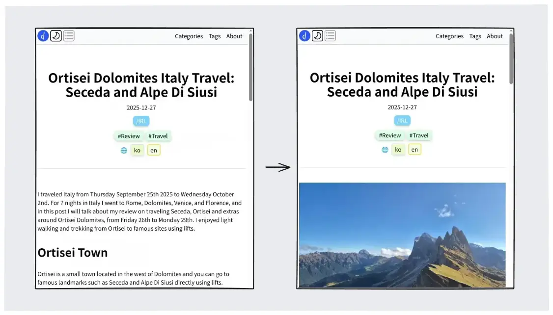
To add to that, document height also changes while scrolling. You press End key on your keyboard and your scroll doesn't actually reach the End.
At first I didn't feel much needs to resolve this;
it looked a little trivial and did not notice a certain level of disturbance.
But this became much clearer after I wrote a post with many images
and applied loading="lazy" attributes
to reduce network congestions.
https://developer.mozilla.org/en-US/docs/Web/Performance/Guides/Lazy_loading
So I tried to repair layout shifts caused by img elements on my blog.
width and height Attributes on img Elements
To reserve space for an image, you give width and height attributes on the HTML element.
With such attributes you let your user agent know how big the image is before it is loaded.
The image's rendered size is given in the width and height attributes, which allows the user agent to allocate space for the image before it is downloaded.
https://html.spec.whatwg.org/multipage/images.html
Both attributes are needed since img elements are rentangles; with only one side value,
the user agent have no idea how big a rectangle should be.
Use both width and height to set the intrinsic size of the image, allowing it to take up space before it loads, to mitigate content layout shifts.
https://developer.mozilla.org/en-US/docs/Web/HTML/Reference/Elements/img#width
Including height and width enables the aspect ratio of the image to be calculated by the browser prior to the image being loaded. This aspect ratio is used to reserve the space needed to display the image, reducing or even preventing a layout shift when the image is downloaded and painted to the screen.
https://developer.mozilla.org/en-US/docs/Web/HTML/Reference/Elements/img#height
The attributes expect pixel values, but they should be denoted as integers in string without px or unit.
<img width="800" height="600">
Then, would they be actually rendered in that size? Like 800px x 600px?
The answer is yes, but not practically, because they have the lowest priority.
If you have any other style rules that have effect on their sizes,
they will be overridden, just like CSS style rules with lower priority.
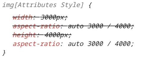
The thing to know about them is that they are overridden by any other styling information whatsoever. That makes them ideal as a fallback.
https://css-tricks.com/whats-the-difference-between-width-height-in-css-and-width-height-html-attributes/
So think of them as a hint.
If you denote the attributes, the elements will have aspect-ratio CSS style rule based on the attributes.
https://web.dev/articles/optimize-cls
If you have CSS styles, the user agent will use the hints
to render images as long as it follows those CSS style rules.
For example, if you have the following rules, images will fill the containers horizontally,
and the user agent will reserve the height for the image since it has height: auto rule.
img {
  width: 100%;
  height: auto;
}
Getting Image Sizes on Node.js
To get local image file dimensions on Node.js,
I recommend image-size library.
It has modern file format support, not just jpg or png, but also webp, heic and avif,
and provide various input supports; reading from a buffer or a local file path.
And reading from file does not read the whole data. Most of image files have a metadata section from the beginning including width and height values, so it reads only parts of files. This shows the library cares about efficiency and performance. https://github.com/image-size/image-size/blob/main/lib/fromFile.ts
Instead of parsing single file on demand, I tried to recursively find all image files and save the whole results.
import {imageSizeFromFile} from 'image-size/fromFile';

export const getImageSize = async (imgPath: string): Promise<{width: number; height: number}> => {
  const {width, height} = await imageSizeFromFile(imgPath);
  return {
    width, height,
  };
};

/**
 * Get all image sizes inside the image folder.
 * Returns an object with the keys of `img.src` (e.g. `'/img/a/b.jpg': {width: 1, height: 1}`).\
 * [NOTE] This function relies on specific setups, such as image folder path.
 * Related logics may malfunction if such setups change.
 */
export const getImageSizes = async () => {
  const supportedFormats = ['webp', 'png', 'jpeg', 'jpg', 'svg'];
  const staticFolderPath = joinPath(rootPath, 'static');
  const imageFolderPath = joinPath(staticFolderPath, 'img');
  const files = await readdir(imageFolderPath, {recursive: true, withFileTypes: true});
  const imageFiles = files
    .filter((file) => file.isFile())
    .filter((file) => supportedFormats.includes(file.name.toLowerCase().split('.')[1]));
  const result: Record<string, Awaited<ReturnType<typeof getImageSize>>> = {};
  for (const imageFile of imageFiles) {
    const imagePath = joinPath(imageFile.parentPath, imageFile.name);
    const imageSize = await getImageSize(imagePath);
    const imageSrc = imagePath.replace(staticFolderPath, '');
    if (!imageSrc) {
      throw new Error('Could not get image src');
    }
    result[imageSrc] = imageSize;
  }
  return result;
};
Also, for efficiency I implemented a simple cache system which is a basically a JSON file. If an image file has not changed since the last time it was cached, it will return the value from the cache.
I had 135 image files of 46MB total. Before adding the cache system, it took about 40ms and it went down to 10ms. It was fast enough already and not a dramatic change, but being better is better.
Integrating the Data Into Sveltekit
At first I tried to make Img.svelte component request the very specific image file dimension to the server,
not every file dimension. Then it would be something like this.
<script>
  const {properties}: Props = $props();
  const size = await requestImageSize(properties?.src);
</script>
<img width={size.width} height={size.height} />
But as of January 2026, from Svelte v5.36, top level await of a component's <script>
is still experimental. I did not want to try it until it became stable.
https://svelte.dev/docs/svelte/await-expressions#Server-side-rendering
Aother solution is {#await block}.
<script>
  const {properties}: Props = $props();
  const sizePromise = requestImageSize(properties?.src);
</script>
{#await sizePromise}
	<p>waiting for the promise to resolve...</p>
{:then size}
  <img width={size.width} height={size.height} />
But during server-side rendering, only the pending branch is rendered.
https://svelte.dev/docs/svelte/await
Since I needed those attributes to be injected as soon as components are rendered,
this option was the my answer.
I ended up injecting the values into page.server.ts's load function.
https://svelte.dev/docs/kit/load
They run before +page.svelte compoent can be rendered and run on the server side only (not client side).
This is ideal to what I am trying to acheive, but it can be a little cumbersome
to do prop-drilling from +page.svelte to Img.svelte components.
I think there might some possible answers to this; like context
or svelte/store.
Also, there are many Img.svelte components
and you don't know what you need them unless you parse your markdown file granuarly at the page level,
so you need to get the whole dimension data of hundreds of image files.
Flickering Even With the Attributes
I had width: 100% style rule to img elements
because I wanted them to be as big as their parent horizontally.
At the same time, I did not want portrait images to be too big so they fill the window vertically.
So I added max-height: 55vh style rule.
img {
  width: 100%;
  height: auto;
  max-height: 55vh;
  object-fit: contain;
}
But this created horiontal blank spaces if the images are of portraits.
I did not want the images to have blank spaces as
I was going to apply placeholder backgrounds until images loaded.
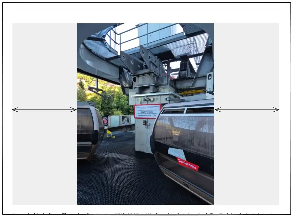
To mitigate this issue, I replaced width: 100% with width: auto and it worked,
but now it has another problem of flickering.
The width and height attributes does not work.
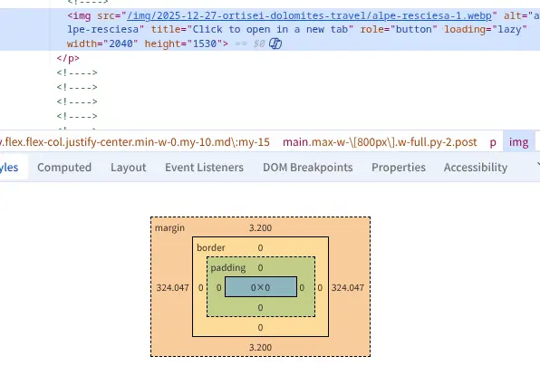
This is because both width and height have auto property.
Since CSS styles have higher property, it will always win against attributes on HTML elements.
So both width and height have no fixed value.
That is why the user agent cannot render it even if it has fixed aspect-ratio.
At least one side must have fixed value, otherwise it would not work.
But doing so will create blank spaces or make images smaller.
The summary is, I am trying to achieve these and doing so is tricky:
- ❎ No layout shift = Fixed width or height
- ❎ No blank space = No fixed width or height
I looked up for the solution and found no reliable answer. Those two contradict the other.
I solved the problem by taking a side step.
Solving by focusing on img elements only is too difficult.
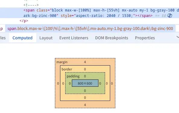
I placed img elements into their containers like div or span,
and added inline style rule for aspect-ratio on the containers based on the image dimensions.
Then I applied the following CSS styles rules.
.img-container {
  display: block;
  max-width: 100%;
  max-height: 55vh;
}
img {
  width: 100%;
  height: auto;
  max-width: 100%;
  max-height: 55vh;
  object-fit: contain;
}
Image containers have display: block. They fill the parent horizontally,
but not overflowing with max-width: 100%.
Since they are blocks and have fixed aspect-ratio properties and,
they try to be as big as possible maintaining the aspect-ratio.
So they will have fixed dimensions, even without child img elements.
Flickering solved, blank space solved.
Since img elements have width: 100%, they fill their containers horizontally.
That ensures they are as big as they can be while not overflowing the parents.
- ✅ No layout shift = Fixed width or height on image containers
- ✅ No blank space = Fixed aspect-ratio on image containers